

Color therapy, or chromotherapy, is part of a branch of creative healing therapies that can be used to help seniors create the perfect living space. Simply, chromotherapy uses color in therapeutic ways. The effects of color have been studied in a wide range of disciplines, from physics and options to psychology and metaphysics. Why and how color is therapeutic is still a mystery, but we know that color affects mood.
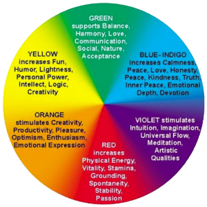
- RED is a strong and invigorating color that has been used to provoke a poor appetite, low iron, low blood pressure and treat fatigue.
- YELLOW has been used for cleansing and purifying purposes, benefiting both the specialized cells of the nervous system and digestive system.
- WHITE is a calming color that embodies cleansing and strength.
- BLUE helps induce feelings of peacefulness and it can reduce stress and even assist with inflammation.
- GREEN is naturally associated with the outdoors, so not surprisingly it helps to lower blood pressure and holds balancing properties.
Use of color in environments designed for seniors is essential. Here are some tips!
1. The visual spectrum for seniors may be diminished — use color contrasts to make color usage more dramatic and noticeable. For those with poor eyesight, injuries and falls can be avoided by making the walls and floor distinctly different colors.
2. If sleeping is elusive switch the color of their bedding — use white, blues and greens in curtains, artwork, blankets and throw pillows.
3. Bright colors in the living areas will help residents stay focused and avoid daytime sleepiness — warm colors such as bright oranges and yellows used in pops throughout the room would do the trick!
4. Use bold solid colors to stimulate appetites in the dining room — red placemats, red flowers in a vase or even red solid plates.
Create a color story in one room — add a mural that embodies nature — ensure the lighting accentuates the hues to create warm and inviting environments. PARsolutions enjoys a challenge and appreciates the use of color in our built environment. Lean on PARsolutions to create a meaningful plan that will leave the right impression and benefit your residents and staff alike. Let’s get a conversation started!